Your cart is currently empty!
Jumping to Statistical Conclusions
Have you attributed your results to the right base data?
It may come as a surprise that the biggest challenge facing black belts and master black belts is usually not in selecting the best statistical technique for analyzing a particular data set. Most statistical techniques work fairly well even if the underlying assumptions are not precisely correct. If a black belt supplements the numerical analysis with graphical evaluation, the chance of making grossly erroneous decisions is negligible.
A mistake that is far more serious–but far more common–is comparing the results of a study to the wrong base data. These “apples to oranges” comparisons often lead to poor decisions and, worse still, to inaccurate beliefs that can derail faith in the Six Sigma approach itself. A recent incident with a client brought this point home for me.
The situation involved a project in the sales organization of a software company. The company had several sales teams and wanted to know if a new approach to closing the sale would improve the rate of closing sales. The company didn’t have a Six Sigma program, and the project was planned and carried out without black belts. The results were presented to management in a classic form: a bar chart (see Figure 1). The team had declared victory, and management–convinced by the “data”–prepared to revamp the sales training to incorporate the new approach companywide. All of the leaders looked forward to the bottom-line improvement they’d see from a 29-percent improvement in the sales closing rate.
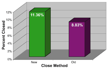
All of the leaders, that is, except Lorraine. She’d received green belt training from her previous employer, and she’d seen enough black belt presentations to know that the analysis of the sales team was seriously flawed. It was undeniable that the project team’s sales close rate was 2.53 percent higher than the sales close rate for the rest of the sales department during the 16 weeks of the test, and, yes, the 2.53 percent did represent a 29-percent improvement over the 8.83-percent rate for the rest of the team. Despite these “facts” and the air of scientific objectivity surrounding the analysis, Lorraine had many unanswered questions. She asked management to delay any decision until she could explore these questions with a Six Sigma consultant. That’s where things stood when I entered the picture.
Lorraine viewed the analysis as important because it would demonstrate that the Six Sigma approach could be applied in this service company, something that skeptical managers didn’t believe. In a meeting with the sales team leader, I was presented with the data shown in Table 1. As often happens, this summary data was all that was available; for a variety of reasons (but chiefly due to a time constraint) the number of sales calls used to compute these rates could not be obtained.
| Week | New | Old |
|---|---|---|
| 1 | 0.1235 | 0.1106 |
| 2 | 0.1313 | 0.1000 |
| 3 | 0.1051 | 0.9580 |
| 4 | 0.0979 | 0.0980 |
| 5 | 0.0920 | 0.0828 |
| 6 | 0.0541 | 0.0793 |
| 7 | 0.0932 | 0.0703 |
| 8 | 0.0864 | 0.0685 |
| 9 | 0.0953 | 0.0610 |
| 10 | 0.1204 | 0.0672 |
| 11 | 0.1046 | 0.0674 |
| 12 | 0.1622 | 0.1063 |
| 13 | 0.1505 | 0.1059 |
| 14 | 0.1510 | 0.1145 |
| 15 | 0.1167 | 0.1055 |
| 16 | 0.1340 | 0.0794 |
| Average | 0.1136 | 0.0883 |
If you are a Lean Six Sigma Black Belt or Master Black Belt, or just statistically inclined, please take a couple of minutes before reading the remainder of this post to think about the data and jot down how you’d proceed from here.
When dealing with the data in Table 1, it’s tempting to apply a statistical technique such as a paired t-test to it. Using Microsoft Excel, it’s a simple matter to compute the t-statistic, which is 4.55, a highly significant result. Statistical purists would ask if the data are approximately normal and an endless variety of other technical questions about the data. I would argue, however, that all of this is premature and, ultimately, beside the point. The first order of business is to determine if we are comparing apples to apples.
Further discussion revealed that the company had not two but nine sales teams, all of the same size. A further complication was that the teams sold different products. More probing uncovered the fact that four of the eight other teams sold a product mix similar to that of the team using the new closing method. At this point it appeared that, to make an apples-to-apples comparison, you would assess the results of these five teams for the 16-week project. Descriptive statistics are shown in Table 2.
| Descriptive Statistics | |||||
| Team | N | Mean | Standard Deviation | Minimum | Maximum |
| 4 | 16 | 0.1152 | 0.04972 | 0.05 | 0.2 |
| 5 | 16 | 0.08814 | 0.02386 | 0.05 | 0.13 |
| 7 | 16 | 0.1182 | 0.03372 | 0.07 | 0.17 |
| 8 | 16 | 0.1481 | 0.03799 | 0.11 | 0.24 |
| New | 16 | 0.1136 | 0.02817 | 0.05 | 0.16 |
Further analysis using nonparametric methods indicated that there are three distinct groups in these data (see Table 3).
| Group | Team(s) | Respective Closing Rate(s) |
|---|---|---|
| 1 | 5 | 8.81% |
| 2 | 4, 7 and new | 11.52%, 11.82% and 11.36% |
| 3 | 8 | 14.81% |
Table 3 presents a decidedly different picture than was originally given to management. The new closing method now appears to be no better than normal. Still, there are bright spots. Assuming that teams 5 and 8 aren’t oranges being compared to apples, potential gains should be possible from discovering why team 5 performs under the norm, and why team 8 outperforms the norm. More information might also be obtained by plotting the 16 weeks over time to identify trends and other patterns. Using the Six Sigma approach, the information can be converted to knowledge, the knowledge to action, and the action to an improved bottom line. It’s more work than the old standby, the bar chart, but it’s worth it.
The complete data file used in this post can be downloaded on the link below.
The challenge is to analyze the data in a number of different ways to determine how the different analyses would affect management decisions. Send your results to me for inclusion in a future post.
Leave a Reply