Your cart is currently empty!
When in Doubt, Get the X-Chart Out!
Phil looked at the data Joan had just handed him. Joan was a recent graduate of an SPC seminar the company had sponsored for administrative personnel and, since Phil had been the Quality Engineer who taught the classes, it was only natural that she would seek his help. She was trying her best to follow Phil’s advice of applying what she had learned to something important to her.
“The numbers are the percentage of invoices sent out that contain errors.” Joan explained.
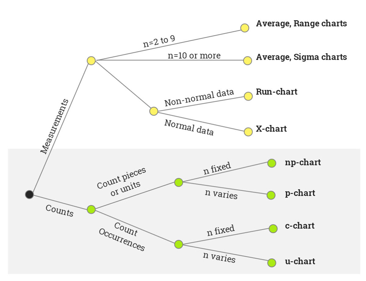
Phil nodded his head and took a graphic out of his desk drawer and showed it to Joan (figure 1). “Remember this?” He asked.
“Sure,” Joan replied. “It’s the decision tree for finding out which control chart to use.”

Phil smiled and nodded. He liked teaching and found it especially rewarding when bright students like Joan were able to apply what they had learned.
“But it doesn’t work for my data.” Joan went on.
Phil’s smile faded. “What do you mean it doesn’t work? It has to work.” He turned the paper towards her. “Here, let me show you.”
He placed his finger on the dot at the left of the chart. “Are we dealing with measurements or counts?” He asked.
“Counts.” Joan responded confidently. “They count the number of invoices with errors.”
Phil ran his finger along the line labeled count until it reached the next dot. “Okay, are we counting pieces or units, or are we counting occurrences?”
“Pieces or units. They count invoices, which are pieces of paper.”
“And the last question is: does the sample size stay the same, or does it vary?”
“It varies. Every month a different number of invoices are processed,” Joan said.
“Then the correct chart is the P-chart,” Phil said, tapping his finger on the graphic with an air of finality.
“Right. That’s what I came up with.” Joan said. “But it doesn’t work.”
Phil looked perplexed. “Of course it works. Maybe you’re having trouble because it’s your first real control chart. I’ll help you construct it. Where are the data?”
Joan pointed to the sheet of paper she’d brought him.
“No, I need the raw data. All this shows is the percentages computed from the raw data.” Phil said.
| p-chart | X-chart | |
|---|---|---|
| LCL | 6.04%-6.37% | 5.96% |
| Average | 10.06% | 10.23% |
| UCL | 13.74%-14.07% | 14.5% |
“That’s the problem, I don’t have it,” Joan explained. “All the sales offices send me are the percentages. They don’t even keep the raw numbers.”
The problem is common. The solution is, of course, to collect data in the proper format. However, this may mean starting from scratch, changing habits firmly rooted in past behavior, expensive training, etc. And it may take months to get enough data to establish valid control limits. These obstacles are often enough to cause people to abandon control charts entirely. Is there nothing Phil and Joan can do?
Fortunately, there is a solution: the X-chart, also known as the individuals chart or X and Moving Range chart. Of course, the X-chart chart is recommended when plotting measurement data from subgroups of size 1. But it is much more versatile. The X-chart is the Swiss Army Knife of control charts. It can be shown that under the assumptions of statistical control and constant sample size, the central limit theorem can be used to show that the other control charts are mathematically related to the X-chart. Better still, under conditions frequently encountered in practice, X-charts can be used to plot percentages, ratios, counts, and other non-measurement data even when the assumptions are only approximately met.
Real-World Example
Assume that Joan has the number of invoices and errors shown in Table 2.
| Invoices | Invoices with Errors | Percentage |
|---|---|---|
| 520 | 61 | 11.73% |
| 577 | 65 | 11.27% |
| 508 | 57 | 11.22% |
| 529 | 64 | 12.10% |
| 542 | 53 | 9.78% |
| 532 | 65 | 12.22% |
| 600 | 39 | 6.50% |
| 538 | 56 | 10.41% |
| 522 | 60 | 11.49% |
| 559 | 59 | 10.55% |
| 593 | 52 | 8.77% |
| 590 | 61 | 10.34% |
| 561 | 58 | 10.34% |
| 534 | 39 | 10.67% |
| 534 | 57 | 10.67% |
| 591 | 46 | 7.78% |
| 531 | 43 | 8.10% |
| 579 | 52 | 8.98% |
| 576 | 66 | 11.46% |
| 566 | 50 | 8.83% |
| 540 | 57 | 10.56% |
| 504 | 65 | 12.90% |
| 541 | 52 | 9.61% |
| 577 | 57 | 9.88% |
| 519 | 50 | 9.63% |
| 13,763 | 1,384 | 10.23% |
Figures 2 and 3 show, respectively, the p-chart and the X-chart for these data. The X-chart was created by using the percentages as if they were measurements. It is obvious that the conclusions are the same with either chart: the process is in statistical control. Table 1 shows that the numbers calculated from the data are close too.


In other words, if all that are available are the percentages, the X-chart provides an excellent approximation to the P-chart. The same conclusion applies to data for the np-chart, c-chart, u-chart, sigma-chart, etc. In all of these cases, and more, the Swiss Army Knife of control charts gets the process operator focused on data. One could even argue that the simplicity of using a single chart instead of several charts outweighs the mathematical advantages in many cases. So when in doubt, get the x-chart out.
If you are interested in learning more about control charts and how to use them, contact the Pyzdek Institute.
One response to “When in Doubt, Get the X-Chart Out!”
-
Great blog, Tom. I fully agree, the XMR/IMR chart is about as useful as statistical methods get and they work with nearly any type of data.
And, they’re easy to create with pencil & paper, out on the shop floor, while trying to help operators make product safer, better, faster & cheaper. They provide, as you indicated, a great focus on the process and what it’s trying to tell us.
Leave a Reply