Simplified SPC: Embracing Statistical Independence
Many hurdles in employing traditional Statistical Process Control (SPC) in batch or continuous processes stem from the disregard of the principle of statistical independence. To confirm the assumption of statistical independence, one can easily employ a scatter diagram.
Consider the example in Table 1, which contains the initial three temperature observations of a solder flux bath. Column one denotes the time at which the temperature was recorded, column two reveals the temperature recorded at five-minute intervals, and column three replicates the data from column two, but each reading is shifted up by one time segment.
| Time | Temperature (X) | Temperature Lagged (Y) |
|---|---|---|
| 8:00 am | 165.7 | 165.9 |
| 8:05 am | 165.9 | 165.4 |
| 8:10 am | 165.4 | next X value |
Plotting these data on a scatter diagram, with data from the second column on the X-axis and data from the third column on the Y-axis, will reveal a pattern. If the temperatures are truly independent, a random scatter pattern should emerge.
As shown in Figure 1, the data with a five-minute lag are interdependent. A clear correlation exists between the current temperature and the one from five minutes ago. For instance, if we increase the heat source of the solder flux bath by five degrees from 165 degrees, the temperature won’t immediately rise to 170 degrees but will increase gradually. This indicates the buffered nature of the solder flux process.

Despite the heat source maintaining statistical control, the temperature of the bath will alter gradually, a phenomenon we term a “random walk”. Traditional X and R charts or X and moving range charts will be ineffective for such data, as demonstrated in Table 1.
Figure 2 presents temperature data plotted as X and moving range charts. It shows statistical control on the moving range chart, while the X chart seems out of control. That’s due to the temperature changes being statistically independent, but the overall change’s magnitude depends on the frequency of process checks.

Nevertheless, the information conveyed by the moving range chart is restrictive, as it doesn’t provide the actual temperature of the solder flux bath, only the change since the last check. Consequently, a slow increase or decrease in temperature would go unnoticed, potentially leading to significant changes in bath temperature.
I must stress that the process represented in Figure 2 is statistically controlled, devoid of any special causes. The perceived lack of control results from the unsuitable use of SPC tools for this type of batch process.
There are numerous strategies to address this issue. I’ll discuss a simple approach that is applicable to many practical scenarios. As the process can’t change instantaneously, why not take advantage of this and check the process less often? Given that SPC’s objective is to detect meaningful changes and if these don’t occur in short time intervals, it doesn’t warrant frequent process checks.
The question then is: what should be the time span between samples? From a statistical standpoint, the answer is simple: as long as necessary to achieve approximate statistical independence between successive samples.
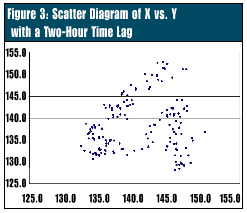
Scatter diagrams can assist in determining this interval. As the gap between samples increases, the correlation progressively weakens. For instance, with a 120-minute interval between measurements of the solder flux temperature, the correlation is minimal enough to have little impact on the X chart (Figure 3). This can be determined by creating scatter plots for various time intervals.
To obtain a sound initial guess, plot a line chart of the temperature data and identify the point at which the temperature pattern begins to repeat. This interval signifies one complete temperature cycle and serves as a reasonable estimation of the time lag necessary for independence.
A 120-minute interval suggests that the process needs checking roughly every two hours. The results could be plotted on a traditional control chart, such as the X and moving range charts, reducing our sampling costs by a factor of 24. With the extended interval, a controlled process will exhibit statistical control on both the X and moving range control charts.
This solution has an advantage over exponentially weighted moving average or CUSUM charts as most people trained in SPC are already familiar with X and moving range charts. However, the solution creates a two-hour gap between process samples. The statistical independence of the observations indicates that the process can change significantly during this time, although a large change may be unlikely.
If this poses a significant issue, as decided by SPC team discussions, the process must be checked more frequently. As this will produce data that aren’t statistically independent, the X chart can’t be used. In these situations, other SPC tools, such as EWMA or CUSUM charts, should be considered. These more sophisticated tools can be justified by the potential cost savings.