The Dullness of Control: A Reevaluation of Statistical Process Control
A process in control is analogous to a patient exhibiting a flatline.
Statistical Process Control (SPC) and I share a love-hate relationship. Its objective? Establish a status quo where variations are scarce and subgroups are consistent. To put it plainly, it’s lackluster.
In the beginning, SPC might offer some excitement. As an SPC method kicks off, the process under evaluation is typically chaotic. Teams experiment by keeping all variables steady while measuring consecutive units or batches. They’ll discover substantial variation, clueless about the reasons, and thoroughly engross themselves in the process. They ponder: We pinpointed everything significant, didn’t we? And maintained them constant, right? Did something shift regardless? Are we confident in our measurement abilities? Their minds race with potential explanations.
However, they eventually isolate one exceptional cause after another. The process enhances, then stabilizes. Eventually, management deems it satisfactory. The team is dissolved. The process is “in control.” The outcome of the next subgroup is predictable, and so is the next, and the next…
To me, a controlled process is reminiscent of mortality. Life is in a constant state of flux; no two days are identical. Even a plant experiences a new reality daily. But when life ceases, change stops.
A process in control parallels a patient who has flatlined— the crucial health metrics display no vitality. Brain activity registers zero. The measurements remain constant and foreseeable, much like a control chart depicting a process in control.
Nevertheless, flatlined patients can occasionally be resuscitated. The right kind of electrical stimulus can rekindle bodily functions. The heart resumes beating, the brain reactivates, the patient begins living anew. Change is reintroduced.
This is precisely what I prefer to do with controlled processes. When I comprehend what maintains their predictable stability, I’m curious to observe the outcome if I stir them up a bit. Let’s amplify X and adjust Y slightly. The process becomes enjoyable again, but now I’m governing the changes instead of blindly fumbling. When employing simple control charts to analyze these experiments’ results, I distinguish this method as Statistical Process Improvement (SPI) from SPC.
People often erroneously believe that the only appropriate way to analyze a process’s impact is via statistically designed experiments. This mistaken belief inadvertently curbs experimentation as DOE is relatively intricate, and only a few individuals within most organizations possess the necessary skills to interpret its cryptic language and esoteric results. However, substantial progress can be achieved using less sophisticated instruments like standard charts and graphs. DOE wasn’t invented until the 20th century, but that didn’t prevent Archimedes or Galileo from making significant discoveries.
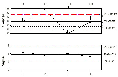
Suppose you’re a process operator who believes that modifying variables a and b could enhance the process. You decide to run both variables at “high” and “low” levels, running 25 parts with a and b low (LL), then 25 with a high and b low (HL), then 25 with a low and b high (LH), and finally 25 with a and b both high (HH). The outcome of such an experiment is depicted in Figure 1’s X and sigma chart.

The sigma chart reveals that despite alterations to a and b, the process dispersion remained stable. However, the process average did shift, as indicated by the averages chart. Running a high and b low increased the average by about five or six compared to normal. In contrast, running ‘a‘ low and ‘b‘ high decreased the average by five or six. Eventually, when both a and b are set to their high levels, the process operates comparably to the normal setting.
