Understanding Variability: Enhancing Health and Management Outcomes
Anyone versed in statistical process control has encountered measurement errors. These arise when a single object measured multiple times yields varying results. This phenomenon isn’t exclusive to industrial settings but is also common in healthcare, as with fluctuating blood pressure readings.
Wander into your local pharmacy, and you’ll likely find a machine for instant blood pressure checks. Stand around for a while, and you’ll inevitably overhear a customer dismiss the high reading, attributing it to the machine’s variability. This variation in healthcare measurements presents a unique challenge. Unlike in manufacturing, where we repeatedly measure a consistent entity, in healthcare, the variables themselves are inherently dynamic.
Take blood pressure, for instance. It is in a constant state of flux. The infamous ‘white coat effect’ can cause blood pressure to surge simply due to the anxiety of being assessed by a medical professional.
Several years ago, while conducting a blood pressure study for a hospital, I found my blood pressure readings alarmingly high. This prompted a visit to my doctor and led me to invest in a personal blood pressure monitor.
Before my doctor’s appointment, I spent several days recording my blood pressure at home to establish a baseline. I then took my monitor to the doctor’s office to measure the ‘white coat effect.’ As expected, the readings taken by the doctor and nurse exceeded my home measurements by nearly 20 points (diastolic). When the doctor used my device, it also showed a 20-point increase. This finding, coupled with the run chart I had prepared, proved valuable to my doctor, leading to a much less aggressive treatment plan.
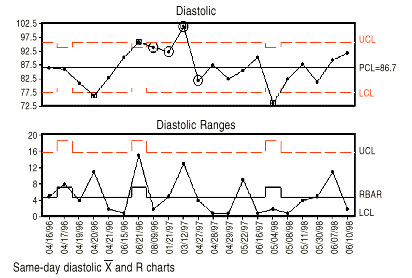
Over the next few years, I monitored my blood pressure while exploring ways to lower it. In Figure 1, the R chart reflects the variation in multiple readings taken on the same day. The average and control limits waver due to the number of times I checked my blood pressure daily. According to the chart, if I check my blood pressure twice a day, I can expect an average difference of five points and a maximum difference of about 15. If I check it three times, the average difference will be about seven points with a maximum difference of about 17 points.

Doctors, being data-driven, often rely on test results to diagnose and evaluate treatment efficacy. However, they usually focus on individual data points rather than patterns and trends. I’ve started incorporating significant test results into a spreadsheet, presenting run charts to my doctor during visits. This practice has fostered a more collaborative dialogue about optimizing my health, rather than a one-sided discussion.
The same concept applies to managers who often fixate on the most recent results rather than trends and patterns. Superior managers use data to dictate actions and assess the efficacy of previous decisions. Presenting them with control or run charts helps contextualize the data, steering conversations towards facts, not personalities or opinions.
Done correctly, this approach can enhance processes, whether in business or biological settings.
