In the realm of quality control and Six Sigma methodologies, the significance of statistical process control (SPC) cannot be understated. Central to these applications are control charts which provide a visual tool for studying process variation over time. A critical addition to this statistical toolkit is the Laney P’ Chart.
Traditional Control Charts: An Overview
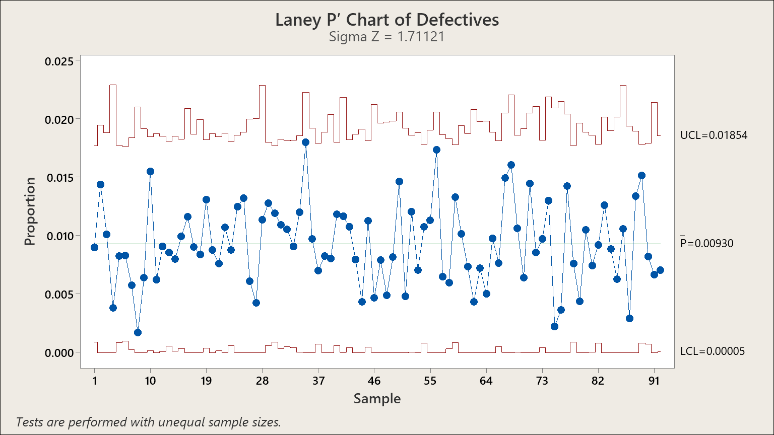
The Laney P’ Control Chart is an exciting innovation in SPC. Traditional control charts for attribute data, such as p-charts and u-charts, rest on assumptions about the underlying distribution of their data, typically binomial or Poisson. These assumptions inherently include the premise that the distribution’s “parameter” or mean is constant over time.
In real-world scenarios, however, this isn’t always the case. Certain environmental factors like weather, for example, may introduce variability (“some days it rains and some days it does not”). This variability is particularly noticeable when the subgroup sizes are large. Traditionally, the solution has been to treat the observations as variables in an individual’s chart. Regrettably, this results in flat control limits, even if the subgroup sizes vary.
The Laney P’ Chart: An Innovative Approach
Enter the Laney P’ Chart, the brainchild of David B. Laney. This innovative approach efficiently addresses this situation, providing a universal technique applicable whether the parameter is stable or not.
David’s method involves taking control charts and adding a new twist to them, one that highlights the subtle but crucial aspect of ‘memory’ within data subgroups. In other words, the method considers that each subgroup might ‘remember’ some characteristics from the previous subgroup, such as weather patterns – a few days of rain followed by a few days of sunshine, and so on.
Implications for Six Sigma Professionals
The implications of this method for Six Sigma professionals are significant. The ability to visualize and control for these complex patterns of variation can offer profound insights into process behavior and improvement opportunities. The Laney P’ Chart provides a more nuanced and comprehensive perspective, which can improve decision-making and enhance Six Sigma processes.
An important caveat to keep in mind is that the Laney P’ Chart method is most clearly visible with large sample sets. This is because the within-subgroup variation reduces, revealing the between-subgroup variation, which is key to understanding overdispersion in your data.
Closing Thoughts
If you’re a Six Sigma professional or someone interested in statistical process control, exploring the Laney P’ Chart could prove to be highly beneficial. Its innovative approach to dealing with ‘memory’ within data subgroups and between-subgroup variation offers a more comprehensive perspective on process behavior and improvement opportunities.
For more in-depth training on the Laney P’ Chart and other Six Sigma tools, you’re welcome to contact the Pyzdek Institute. We offer a wide array of training programs, coaching, and support resources to elevate your Six Sigma journey. Whether you’re a beginner or a seasoned professional, we’re here to help you navigate and master the complex world of Six Sigma.
For more information about the Laney P’ chart and other tools to elevate your Six Sigma journey, stay tuned to our blog for more insights and updates.

(1946-2021)
David B. Laney worked for 33 years at BellSouth as Directory of Statistical Methodology. He was a pioneer at BellSouth in TQM, DOE, and Six Sigma. David’s p-prime chart is an innovation that is being used in a wide variety of areas. It is now included in many statistical applications, such as Minitab and SigmaXL.
Leave a Reply