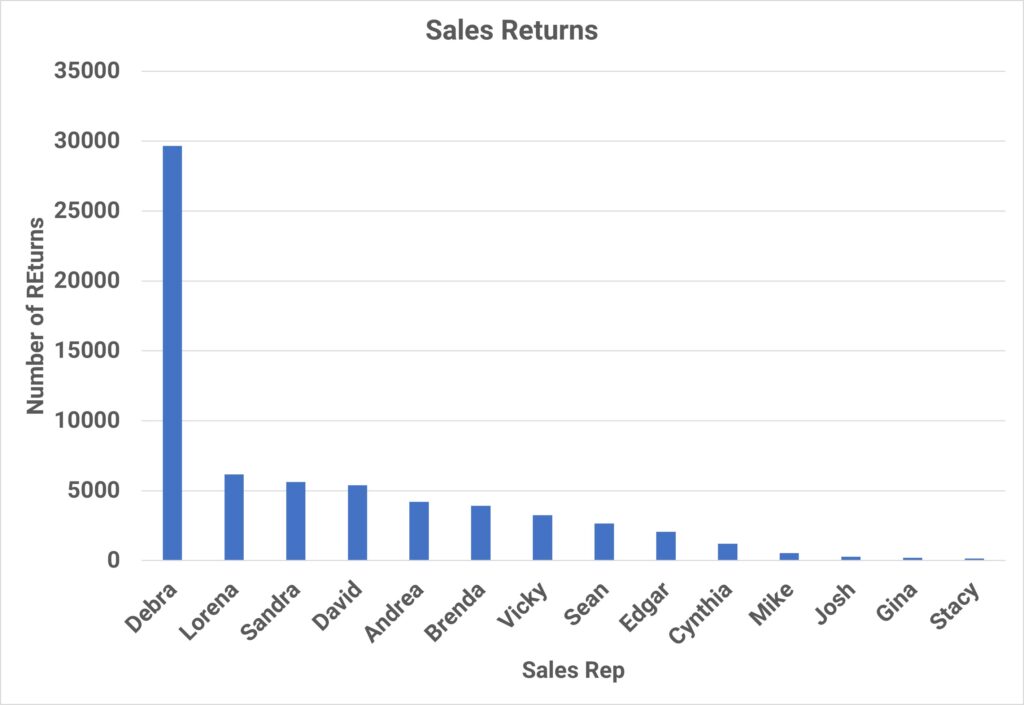
Many people have built the Bar Chart in figure 1 below and called it a Pareto Chart. Even I in my early years a Quality Engineer created this chart as a “Pareto chart”. But this is NOT a Pareto Chart. It is only a Bar Chart.

Why? This is because this bar chart does not show us, without some mental work, the Pareto Principle that it is named after. Is it improper to use this Bar Chart? No the Bar Chart is perfectly fine if it shows what you wanted. But to call it a Pareto is improper.
The Pareto Principle:
The Pareto principle states that 80% of the impact of the problem will show up in 20% of the causes. Or as Vilfredo Pareto, the Italian economist had stated it; “80% of the wealth is owned by 20% of the people.” It was Joseph M. Juran, a Quality Guru, which named the principle after Vilfredo Pareto. It has also been called the 80-20 rule.
The Chart:
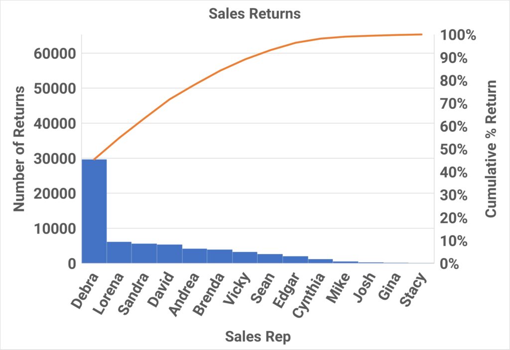
The Pareto Chart, see figure 2 below, is a bar chart that displays by frequency, in descending order, the most important defects and also has the cumulative percentage on a second y-axis (to the right of the chart). The Bars gives us the biggest hitter on the left, but the cumulative percentage line lets us display the Pareto Principle. If the Pareto principle is evident, about 20% of the categories on bottom of the chart will have about 80% of the impact on the problem.


Leave a Reply