Hospital processes produce many things. Most of them are desirable outcomes, such as healthy newborn babies, new hip joints, cancer-free patients and blood flowing freely through once-blocked coronary arteries. In other words, happy, healthy and satisfied patients. These results are why healthcare professionals chose their field. They generate revenue that patients are happy to pay because the value they receive exceeds the cost.
But not all of the things hospitals produce are desirable. Hospitals also produce botched surgeries, surgical sponges sutured into patients, X-rays that must be taken repeatedly, falls, infections and many other unwelcome errors. These things also result from hospital processes, but because they are not part of the planned outcome, we tend to overlook the fact that they, too, are caused. Instead, many healthcare professionals look upon these poor results as unfortunate occurrences that appear without cause. Of course, they tend to accept these events as inevitable, which in turn assures continual recurrence.
The quality profession’s major contribution to the world is the ability to scientifically investigate process variation. This helps people see which outcomes, pleasant and unpleasant, are created by the system itself, and which are created by factors outside the system. Armed with this knowledge, workers can determine which action will most likely improve the process. Improvement can be an increase in the desired outcome, a decrease in undesired outcomes, improved efficiency or any combination of these. The approach is generic. It can—and has been—applied to improving healthcare processes. Let’s look at an example.
Hospital Falls
As I waited outside my father’s hospital room for him to finish dressing to come home, I heard a noise. The sound was distinctive: a body hitting the hard floor. I rushed in, a nurse close at my heels. My father’s elderly roommate lay on the floor, embarrassed as he tried to stand. The nurse and I helped him to his feet.
“I’m OK,” he assured us. “I leaned on the table, but it rolled and I fell.” He pointed to the small cabinet between the two beds. The nurse nodded as she guided him to the chair.
“That happens all the time,” the nurse responded. “They should replace those darned tables. They’re on rollers to make it easier to move them for patient access and cleaning of the room, but they cause a lot of accidents.”
Luckily, only the gentleman’s pride was hurt. But as I continued to wait for my father, I took note of the fact that the nurse continued with her rounds. If she ever reported the event, it was long after it occurred. Chances are it was never reported.
Later that day, I phoned the hospital and asked if they kept data on falls. “Of course,” I was told. “Hospitals record everything.”
Not quite everything, I thought to myself as I recalled the event earlier that day. Probably anything that caused an injury. Only part of the story, but worth looking at in any event. The hospital faxed me the data on falls (see Table 1).
| Month | Falls |
|---|---|
| Dec-16 | 4 |
| Jan-17 | 4 |
| Feb-17 | 5 |
| Mar-17 | 6 |
| Apr-17 | 0 |
| May-17 | 4 |
| Jun-17 | 2 |
| Jul-17 | 4 |
| Aug-17 | 4 |
| Sep-17 | 3 |
| Oct-17 | 3 |
| Nov-17 | 6 |
| Dec-17 | 2 |
| Jan-18 | 2 |
| Feb-18 | 4 |
| Mar-18 | 3 |
| Apr-18 | 2 |
| May-18 | 6 |
| Jun-18 | 5 |
| Jul-18 | 6 |
| Aug-18 | 5 |
| Sep-18 | 4 |
| Oct-18 | 3 |
| Nov-18 | 5 |
| Dec-18 | 5 |
| Sum | 97 |
All organizations keep such data. However, it’s in a form that’s seldom used. The data contains information, but not in a format that people can easily interpret. To help us glean some knowledge from this data, let’s consider three statistical process control tools: the histogram, run chart and control chart.
A Histogram of Hospital Falls
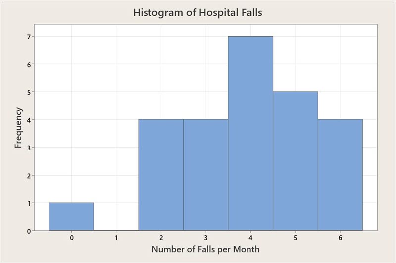
A histogram shows the empirical distribution of the falls data. Figure 1 shows that the number of falls reported each month varies from zero to six, with four falls per month being the most common. The number of falls appears to be fairly consistent; no months contain a great number of falls.

A Run Chart of Hospital Falls
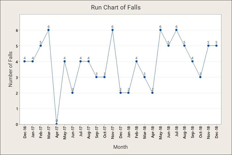
Where the histogram is a snapshot, the run chart is a movie. In Figure 2 we see the falls data stretched out over time. Applying statistical tests produces no significant data patterns. The run chart helps put the data in a context, which helps prevent misconceptions caused by looking only at a portion of the data.

While run charts allow us to examine patterns, they are less helpful in analyzing outliers or freak values. Control charts provide control limits that help do this. Creating a control chart of the falls data requires first determining the number of patient care days (PCDs) for the hospital each month (see Table 2). After all, one way to reduce falls to zero is to admit no patients!
| Month | Falls | 100 PCD | U | U-bar | UCL |
|---|---|---|---|---|---|
| Dec-16 | 4 | 2 | 2 | 2.2 | 5.4 |
| Jan-17 | 4 | 2 | 2 | 2.2 | 5.4 |
| Feb-17 | 5 | 2 | 2.5 | 2.2 | 5.4 |
| Mar-17 | 6 | 2 | 3 | 2.2 | 5.4 |
| Apr-17 | 0 | 2 | 0 | 2.2 | 5.4 |
| May-17 | 4 | 2 | 2 | 2.2 | 5.4 |
| Jun-17 | 2 | 1 | 2 | 2.2 | 6.7 |
| Jul-17 | 4 | 1 | 4 | 2.2 | 6.7 |
| Aug-17 | 4 | 1 | 4 | 2.2 | 6.7 |
| Sep-17 | 3 | 2 | 1.5 | 2.2 | 5.4 |
| Oct-17 | 3 | 2 | 1.5 | 2.2 | 5.4 |
| Nov-17 | 6 | 2 | 3 | 2.2 | 5.4 |
| Dec-17 | 2 | 2 | 1 | 2.2 | 5.4 |
| Jan-18 | 2 | 2 | 1 | 2.2 | 5.4 |
| Feb-18 | 4 | 2 | 2 | 2.2 | 5.4 |
| Mar-18 | 3 | 2 | 1.5 | 2.2 | 5.4 |
| Apr-18 | 2 | 2 | 1 | 2.2 | 5.4 |
| May-18 | 6 | 2 | 3 | 2.2 | 5.4 |
| Jun-18 | 5 | 1 | 5 | 2.2 | 6.7 |
| Jul-18 | 6 | 1 | 6 | 2.2 | 6.7 |
| Aug-18 | 5 | 1 | 5 | 2.2 | 6.7 |
| Sep-18 | 4 | 2 | 2 | 2.2 | 5.4 |
| Oct-18 | 3 | 2 | 1.5 | 2.2 | 5.4 |
| Nov-18 | 5 | 2 | 2.5 | 2.2 | 5.4 |
| Dec-18 | 5 | 2 | 2.5 | 2.2 | 5.4 |
| Sum | 97 | 44 |
A Control Chart of Hospital Falls
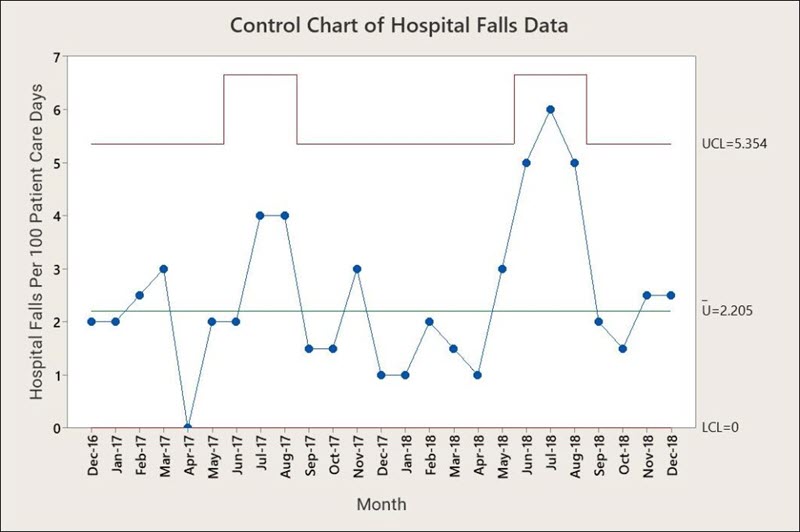
The U-chart in Figure 3 shows reported falls per 100 PCDs. It also includes a centerline showing the process average and an upper control limit on the number of falls per 1,000 PCDs. Note that the UCL rises and falls as the number of PCDs changes.

The control chart shows that the rate of falls is “in control.” This means that if nothing is done each month, the hospital can expect to average about two serious falls per 100 PCDs. Some months no people will fall and hurt themselves, other months a half-dozen or more injuries might occur. That is, unless someone takes the time to look into the reasons why people fall. When management decides to do that, a whole host of Six Sigma techniques can be brought to bear on the problem, such as cause-and-effect diagrams and Pareto analysis.
And maybe, just maybe, those darned tables will be replaced!


Leave a Reply