In the world of work, people have a natural tendency to become emotionally involved in their jobs. This is vital if they are to take pride in their accomplishments and do quality work. However, this involvement also makes it difficult for most people to see problems in their work.
SPC benefits users by directing attention toward the facts and thus promoting reason and rationality in problem solving. In this posting, I’ll put that belief to the test by using SPC to explore an issue that has generated much emotion lately: global warming. Global warming is complex, dynamic, important and imperfectly understood. Statistical methods are designed to help us analyze just such processes.
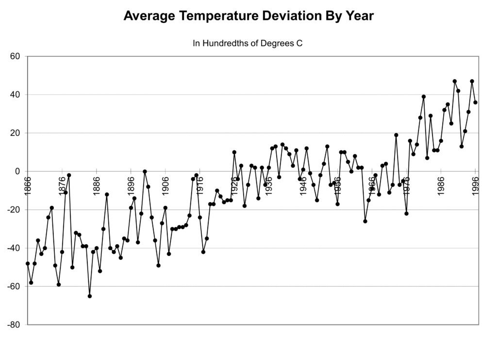
The figure of merit in this case is the Earth’s mean temperature. Figure 1 presents a run chart of the data. The numbers are coded and show the deviation in average global temperature in hundredths of degrees C from the base period mean temperature. The base period is from 1951 to 1980. A value of 0 indicates an annual global mean temperature equal to the base period mean, while a value of 20 indicates a temperature 0.20° C below the average during the base period. The chart includes data from 1866 to 1996. (There is a comment about more recent data.)

Putting the data into a run chart shows 131 years of temperature variation at a glance. Initially, temperatures are cooler, roughly 0.50° C below the base period mean. At the end they are warmer, roughly 0.25° C above the base period mean.
In SPC, the preferred approach to determine potential long-term process performance is to conduct a process capability analysis. In a PCA, changes are carefully controlled to determine how the process behaves under ideal conditions. Control limits are computed from the PCA data and used to identify important changes that occur in the future.
Needless to say, we can’t to do this with many of our processes, including the global warming process. Instead, we are forced to deal with things the way they are. A first step is to compute the control limits for these data. To do this, we first must estimate the process average and standard deviation, s. The temptation is to compute the average and s by using a spreadsheet such as Excel, which gives us an average of 10.4 and s=24.30.
However, computing s in this way only works if the process is in a state of statistical control. When the process’s state is unknown, it’s far better to base our sigma estimate on the “moving range.” A recent article in Quality Engineering shows that s can be estimated accurately by multiplying the median moving range by 1.047. With this method, we get s=10.47.
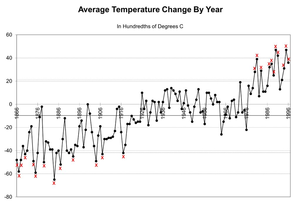
The control limits are set at plus-and-minus three standard deviations from the long-term mean, giving 41.8 and 21.1 using coded measurement units. Figure 2 shows the control chart with the average and control limits drawn in. There are points below the lower control limit at the beginning of the chart, followed by points above the upper control limit at the end of the chart. This is an SPC definition of a trend.

We’ve now established that between 1866 and 1996, the global mean temperature measurements increased. If we compare the first 20 years on the chart to the last 20, the change is +64.4, or an increase of 0.64° C. The next step is to identify the special cause or causes behind this change. We will explore this issue in a future post.

Leave a Reply