On a previous post, I presented an SPC analysis of global temperature change that indicated a special cause of variation affecting the temperature data. While theories abound to explain the temperature increase, I will explore only three: urbanization, or the “heat island” effect; carbon dioxide entering the atmosphere due to human activities; and the sunspot cycle.
The Heat Island Effect
With SPC, it’s vital to identify, and compensate for, known sources of variation. In studying global warming, scientists noted that heat generated in cities caused urban meteorological stations to register higher average temperatures than rural stations. Because stations tend to cluster in urban regions, some theorists have argued that the existing data exaggerates the global warming trend.
As with all SPC studies, the measurement system should be evaluated before drawing any conclusions from the data. Surface air and surface sea temperatures are basic weather and climate parameters. One scientific study states:
“Errors in surface air temperature trends due to changes of instrumentation, station location and diurnal sampling can be substantial at individual locations. The most serious problem is probably urban heat island effects, which tend to be systematic. … A more precise test for the United States revealed large differences in certain regions such as Southern California, but averaged over the contiguous United States, the temperature change differed by only 0.1° C.”
The data presented in my previous post showed a temperature increase of about 0.64° C, so the urban heat island effect may account for between 15.6 percent and 31.2 percent of the increase. I found no numerical estimates of instrumentation, station location and diurnal sampling errors mentioned in the research.
CO2 Released Due to Human Activity
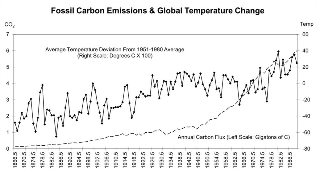
Global warming is caused by so-called greenhouse gases, which include, besides CO2, water vapor, methane and hydrocarbon. Most of these occur naturally. Figure 1 presents a line chart where the CO2 emitted by human activity is overlaid on the temperature data.

The chart shows an unmistakable increase in CO2. From the end of the last ice age until the mid-19th century, total atmospheric CO2 varied from 260 to 280 parts per million. Since then, the CO2 level has risen to about 340 parts per million. Adding the other greenhouse gases, the total is now about 407 parts per million of greenhouse gases.
Note that between 1867 and 1946, CO2 emissions increased by about 0.9 gigatons while temperature increased by about 0.4° C. Only 15 percent of the total CO2 increase occurred during this period, compared with about two-thirds of the total temperature increase.
Based on the global warming hypothesis, the increase in greenhouse gases since the mid-19th century should have produced a temperature increase of about 1° C to 2° C, but the data show that this hasn’t happened. Thus it appears that the link between the level of greenhouse gases and global temperature is poorly understood.
Sunspots
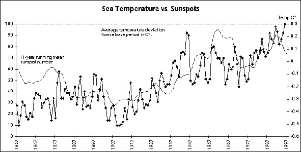
Dr. George Reid, senior scientist at the National Oceanic and Atmospheric Administration, examined the sea surface temperature record for the last 130 years and found an interesting correlation with the 11-year-running mean sunspot number. Figure 2 shows the correlation between sea temperature and sunspots. Though not identical, the two time series have several features in common, including a prominent minimum during the early 1900s, a steep rise to maximum in the 1950s, a drop in the 1960s and early 1970s, and then a rise that continues to date. While not perfect, the correlation between these two sets of data appears closer than the correlation between CO2 levels and temperature.

A complete analysis of an issue as complicated as global warming would cover many other aspects. However, the point of the past two columns has been to illustrate an approach to investigating any process. The approach can be summarized as follows:
- Collect time-ordered data, and plot them on a control chart.
- Examine the chart for special-cause data points and patterns.
- If special-cause data are found, prepare a list of possible causes.
- Collect data on the possible causes, and plot them along with the process data to investigate the correlation graphically.
- Put your conclusions to the common-sense test. Are the explanations of the observed associations reasonable?
- Take action based on your conclusions.
As social problems become politicized, the truth is often obscured. The same thing happens in business. But people who understand SPC have the tools needed to approach these problems rationally. Try collecting and analyzing data on problems that concern you. You may be surprised by the results.

Leave a Reply