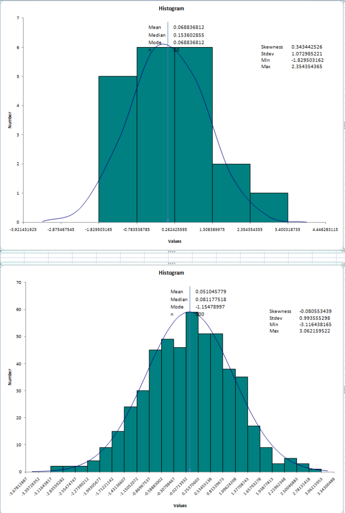
One of the exercises I assign to students in my training involves creating two histograms from normally distributed random numbers. The results often look similar to those shown in figure 1. When I ask students to comment on their histograms I usually get comments about the averages, spread, and other statistical properties. However, that misses the point I’m trying to teach.

When we do Six Sigma we usually spend a lot of time mining historical data from databases. Sometimes the sample sizes are large, and sometimes they can be quite small. In fact, even large sample sizes can become small when we slice-and-dice them drilling down with various categories and sub-categories in search of CTQs. Statistical software will often automatically fit a normal curve to histograms created from these data. It’s often tempting to use the fitted curves to make an eyeball judgment about the normality of the data. Sometimes this is a good idea, and sometimes it isn’t. If the sample sizes are small, then the curve may not appear to fit the data very well simply because of small sample variation. Witness the top histogram in figure 1 for an example of a curve fitted to a histogram from a sample size of n=20. The histogram looks like a poor fit, but the p-value of a normality test tells us that the fit is pretty good anyway. So we’re probably safe assuming normality and acting accordingly.
The lower curve is fitted to a sample of n=500 data values. It appears to be a much better fit, and the p-value will back this conclusion. But what if the eyeballed curve fit and the p-value disagree?

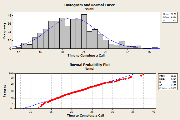
Sometimes the fit of the curve is “close enough,” but the p-value will tell you that the fit is awful. Take a look at figure 2. The histogram suggests that the normal curve fits the data pretty well. There are many practical situations where you could use the normal distribution to make estimates and your estimates would be just fine. These are data on the time it takes to complete technical support calls. If you assume normality and you estimate costs or make a decision about process acceptability, your decisions will be essentially correct. However, the probability plot and AD goodness-of-fit statistic clearly show that the data are not normal and that the lack of fit is particularly poor in the tails (p < 0.005.) A closer examination shows that even in the tail areas the discrepancies are fractions of a percent. For example, the normal distribution estimates that 99.9% of all calls will take less than 35 minutes to complete, while the data show about 99.5%. Chances are these differences are of little or no practical importance.
The point is that in the business world we often need to make decisions and then get on to other, more urgent matters. The normal distribution is a handy device for getting quick estimates that are useful for such decisions. If your sample size is relatively large (say 200 or more) then you can go with the normality assumption if the fitted curve looks reasonably good. On the other hand, if you only have a small amount of data, you can still use the normality assumption if the histogram fit looks lousy, providing the p-value of the goodness-of-fit statistic says the normal curve is okay, i.e., if p > 0.05. The normality assumption is so useful that it’s worth using as a default, even if you bend the rules a bit.

Leave a Reply