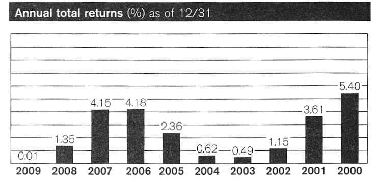
Normally when the bottom axis represents time periods, the more recent time periods are on the right side. Not so with this graphic of Schwab U.S. Treasury Money Fund dated April 30, 2010. On this chart the most recent period is on the left, not the right. Nice try Schwab!
When using graphics in quality and process improvement, care must be taken not to inadvertently “lie” with statistics. Sometimes even the best get it wrong.
Leave a Reply