One day, early in my quality career, I was approached by my friend Wayne, the manager of our galvanizing plant.
‘Tom,” he began, “I’ve really been pushing quality in my area lately, and everyone’s involved. We’re currently working on a problem with plating thickness. Your reports always show a 3-percent to 7-percent reject rate, and we want to drive that number down to zero.”
I, of course, was pleased. The galvanizing area had been the company’s perennial problem child. “How can I help?” I asked.
“We’ve been trying to discover the cause of the low thicknesses, but we’re stumped. I want to show copies of the quality reports to the team so they can see what was happening with the process when the low thicknesses were produced.”
“No problem:’ I said, “I’ll have them for you this afternoon.”
Wayne left, and I went to my galvanizing reports file. The inspection procedure called for seven light poles to be sampled and plotted each hour. Using the reports, I computed the daily average and standard deviation by hand (this was before the age of personal computers). Then, using a table of normal distribution areas. I found the estimated percent below the low specification limit. This number had been reported to Wayne and a number of others. As Wayne had said, the rate tended to be between 3 percent and 7 percent.
I searched through hundreds of galvanizing reports, but I didn’t find a single thickness below the minimum. My faith in the normal distribution wasn’t shaken, however. I concluded that the operators must be “adjusting” their results by not recording out-of-tolerance thicknesses. I set out for the storage yard, my thickness gage in hand, to prove my theory.
Hundreds of parts later, I admitted defeat. I simply couldn’t find any thickness readings below the minimum requirement. The hard-working galvanizing teams met this news with shock and dismay.
“How could you people do this to us?” Wayne asked.
This embarrassing experience led me to begin a personal exploration of just how common normal distributions really are. After nearly two decades of research involving thousands of real-world manufacturing and nonmanufacturing operations, I have an announcement to make: Normal distributions are not the norm.
You can easily prove this by collecting data from live processes and evaluating it with an open mind. In fact, the early quality pioneers (such as Walter A. Shewhart) were fully aware of the scarcity of normally distributed data. Today, the prevailing wisdom seems to say, “If it ain’t normal, something’s wrong.” That’s just not so.
For instance, most business processes don’t produce normal distributions. There are many reasons why this is so. One important reason is that the objective of most management and engineering activity is to control natural processes tightly, eliminating sources of variation whenever possible. This control often results in added value to the customer. Other distortions occur when we try to measure our results. Some examples of “de-normalizing” activities include human behavior patterns, physical laws and inspection.
Human Behavior Patterns
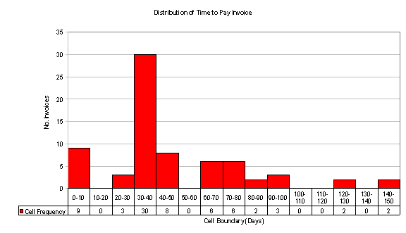
Figure 1 shows a histogram of real data from a billing process. A control chart of days-to-pay (i.e., the number of days customers take to pay their bills) for non-prepaid invoices showed statistical control. The histogram indicates that some customers like to prepay, thus eliminating the work associated with tracking accounts payable. Customers who don’t prepay tend to send payments that arrive just after the due date. There is a second, smaller spike after statements are sent, then a gradual drop-off. The high end is unbounded because a few of the customers will never pay their bills. This pattern suggests a number of possible process improvements, but the process will probably never produce a normally distributed result. Human behavior is rarely random, and processes involving human behavior are rarely normal.

Physical Laws
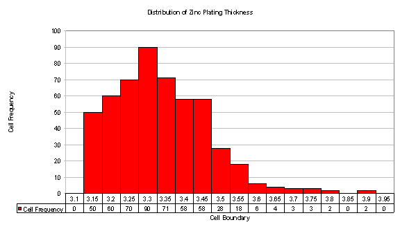
Nature doesn’t always follow the “normal law” either. Natural phenomena often produce distinctly non-normal patterns. The hot-dip galvanizing process discussed previously is an example. A metallurgist described the process to me (but too late, alas, to prevent the aforementioned debacle) as the creation of a zinc-iron alloy at the boundary. The alloy forms when the base material reaches the temperature of the molten zinc. Pure zinc will accumulate after the alloy layer has formed. However, if the part is removed before the threshold temperature is reached, no zinc will adhere to the base metal. Such parts are so obviously defective that they’re never made.
Thus, the distribution is bounded on the low side by the alloy-layer thickness, but (for all practical purposes) unbounded on the high side because pure zinc will accumulate on top of the alloy layer as long as the part remains submerged. Figure 2 shows the curve for the process – a non-normal curve.

Inspection
Sometimes inspection itself can create non-normal data. ANSI Y14.5, a standard for dimensioning and tolerancing used by aerospace and defense contractors, describes a concept called “true position.” The true position of a feature is found by converting an X and Y deviation from target to a radial deviation and multiplying by two. Even if X and Y are normally distributed (of course, they usually aren’t), the true position won’t be. True position is bounded at zero and the shape often depends solely on the standard deviation.
Many other inspection procedures create non-normal distributions from otherwise normal data. Perpendicularity might be normally distributed if the actual angle were measured and recorded. Quite often, though, perpendicularity is measured as the deviation from 90 degrees, with 88 degrees and 92 degrees both being shown as 2 degrees from 90 degrees. The shape of the resulting distribution varies depending on the mean and standard deviation. Its shape can range from a normal curve to a decidedly non-normal curve. This apparent discrepancy also applies to flatness, camber and most other form callouts in ANSI Y14.5. The shape of the curve tells you nothing about your control of the process.
Implications
At this point, a purist might say, “So what?” After all, any model is merely an abstraction of reality and in error to some extent. Nevertheless, when the error is so large that it has drastic consequences, the model should be re-evaluated and perhaps discarded. Such is often the case with the normal model.
Process capability analysis (PCA) is a procedure used to predict the long-term performance of statistically controlled processes. Virtually all PCA techniques assume that the process distribution is normal. If it isn’t, PCA methods, such as Cpk, may show an incapable process as capable, or vice versa. Such methods may predict high reject rates even though no rejects ever appear (as with the galvanizing process discussed earlier) or vice versa.
If you’re among the enlightened few who have abandoned the use of “goal-post tolerances” and PCA, you’ll find that assuming normality hampers your efforts at continuous improvement. If the process distribution is skewed, the optimal setting (or target) will be somewhere other than the center of the engineering tolerance, but you’ll never find it if you assume normality. Your quality-improvement plan must begin with a clear understanding of the process and its distribution.
Failure to understand non-normality leads to tampering, increased reject rates, sub-optimal process settings, failure to detect special causes, missed opportunities for improvement, and many other problems. The result is loss of face, loss of faith in SPC in general, and strained customer-supplier relations.
Example
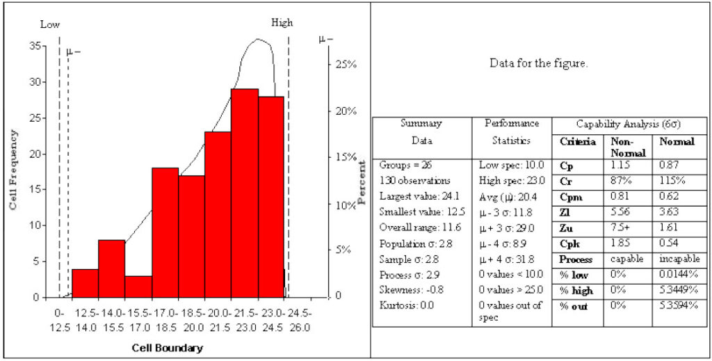
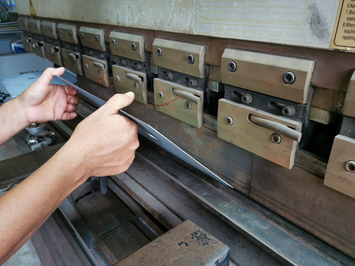
Let’s look at what happens when we try to perform a standard process capability analysis on a non-normal distribution. Suppose our data consists of measurements from a shearing operation. The specification calls for a specific dimension to be between 10 units and 23 units. A process capability analysis shows an in-control X-bar and R chart for 26 subgroups of five units per subgroup, and no parts are out of tolerance. The data distribution is shown in Figure 3.

If you run a process capability analysis on this data while assuming a normal distribution, you’ll get a Cp of 0.87 and a Cpk of 0.54. This means that you should expect to see more than 5 percent of parts rejected – but our raw data doesn’t bear this out.
The lesson here is that it’s counterproductive to use statistics by rote, blindly plugging numbers into formulas and accepting the results. Plot a histogram of the data after you’ve attained statistical control, and think about how the histogram pattern relates to the real world. In this case we would expect a non-normal distribution. The upper limit is bounded by the distance from the blade to the backstop (you can’t cut a piece bigger than this), and the lower limit is bounded by zero. The process should be off-center to the high side because the pieces are likely to come off the backstop only a small amount.
We can still calculate the process capability if we can first find a curve that fits our data distribution and then use this model to predict yields. The Johnson translation is one such approach to curve fitting. The Johnson system translates any continuous distribution into a normal distribution, at which point a process capability analysis can be performed.
Briefly, there are three families of Johnson curves:
- Su curves are unbounded and cover the t and normal distributions, among others.
- Sb curves cover bounded distributions. The distributions can be bounded on either the lower end, the upper end or both. This family covers gamma distributions, beta distributions and others.
- SL curves cover the log-normal family.
In our example, the raw data were used to create a grouped-frequency table (see Table 1).
| Cell Boundary | Frequency | Cumulative Frequency | Percentile $$\frac {\left (i-1/2 \right )}{n}$$ |
|---|---|---|---|
| 12.5-14.0 | 4 | 4 | 0.0269 |
| 14.0-15.5 | 8 | 12 | 0.0885 |
| 15.5-17.0 | 3 | 15 | 0.1115 |
| 17.0-18.5 | 18 | 33 | 0.2500 |
| 18.5-20.0 | 17 | 50 | 0.3808 |
| 20.0-21.5 | 23 | 73 | 0.5577 |
| 21.5-23.0 | 29 | 102 | 0.7808 |
| 23.0-24.5 | 28 | 130 | 0.9962 |
For those interested in the math, the best-fit Johnson curve family was found by hand using the method described in Slifker and Shapiro.1 A four-parameter Johnson Sb curve was fitted to the grouped frequency data, providing the estimates:
\delta=0.4816
\gamma=0.5705
\lambda=10.1584
\xi=14.2280
As mentioned earlier, the Johnson system translates any continuous distribution into a normal distribution. For the Sb family, the translation equation (Equation 1) is:
Z=\gamma+\delta\ln\left (\frac {X-\xi}{\xi+\lambda-X}\right ) where Z is the standard normal deviate. In this example, the equation is:
Z=0.5705+0.4816\ln\left (\frac {X-14.2280}{24.3864-X}\right )The Johnson Sb family is bounded on the low side by e and on the high side by ξ+λ. With our data, this means that the process shouldn’t produce anything less than 14.228 or greater than 24.3864 units in size. The upper bound has a physical explanation: the backstop of the shear. The lower bound is simply the result of mathematics; nothing prevents the shear operator from allowing the piece to come off of the stop further. In fact, there were three values below the “lower bound.” (This was not the case with the lower bound found via the more accurate computer method, which follows.)
Because the bounds are both within the specification limits of 10 to 25, we expect a yield of virtually 100 percent from this process, and that’s what we get. Computing the capability indexes is a bit tricky. Because both of the specifications are beyond the bounds of the fitted curve, it’s impossible to compute Cpk. Even if we could compute Cpk, deciding on which specification was “closest” would be difficult. Because the backstop of the shear provides an upper physical limit on size, we want the distribution to off-center toward the high side. This is the case with the sample data, which has a mean of 20.4 instead of 17.5, which is the midrange of the specification.
The calculation of Cp can be approached in two different ways. Cp can be conceptualized as a comparison of the process’s “natural tolerance” to the engineering requirement. Under the assumption of normality, the determination of the natural tolerance becomes somewhat arbitrary because the normal distribution is theoretically unbounded. But the Johnson Sb distribution is theoretically bounded on both sides, and the distance between the upper bound and the lower bound is λ. Thus, one logical candidate for the Sb version of Cp is
C_{p}=\frac {specification \ spread}{\lambda}With our example, this would give
C_{p}=\frac {15}{10.1584}=1.48This Cp index indicates that the process is capable of meeting the specification spread. We can obtain a Cp index that is more comparable to the traditional Cp value than the Cp value shown above. To do this, note that the traditional Cp considers the process natural spread to be represented by 6σ. When using the Johnson translation system, we can determine the X value corresponding to any standard normal curve. With the Sb system we solve Equation 1 for X, giving
X=\xi+\frac {\lambda}{1+e^{\frac{\left ( \gamma-Z \right )}{\delta}}}For our data, this gives
X=14.2280+\frac {10.1584}{1+e^{\frac{\left (0.5705-Z \right )}{0.4816}}}Solving this equation for Z = -3 and Z = 3 gives X(-3) = 14.234 and X(3) = 24.321. The distance between these two values, 10.087 measurement units, is analogous to the distance of the “natural 6σ process spread” for normally distributed data. Thus,
C_{p}=\frac {15}{10.087}=1.49Of course, this is better than the Cp we found earlier using the total process spread.
Before we had the help of computers, performing such calculations was a tedious process that required hours of work so it was rarely done. Today, however there is no reason to not make use of software that can perform this analysis in seconds. Using the computer, we get the results shown in Figure 3. The computer finds the best-fit Johnson family and parameters using the method of moments, which produces more accurate results than the histogram-based method just described. The method of moments is much too cumbersome to attempt by hand, but the computer can do an analysis in few seconds. The computer displays the results of the capability analysis using both the best-fit curve and the assumption of normality. Observe that the best-fit curve analysis shows the process to be capable of meeting the requirements easily, while the usual (normal) method shows the process to be incapable. Of course, the opposite situation may also occur at times.
Conclusions and Recommendations
As with most things, PCA is a worthwhile endeavor, but one with pitfalls. I advise that you use the techniques of process capability analysis, including process capability indices (DCI), however:
- First and foremost, get the process into statistical control.
- Be sure that the curve fits the data, especially in the distribution tails.
- Remember that yields are more direct measurements of process performance than PCIs. Be sure that actual counts confirm the yield predictions based on models.
- Never lose your skeptic’s eye. Use common sense at all times.
- Verify that the predicted performance actually occurs with future runs. This is much more likely to be the case if the process is kept in statistical control.
- Don’t use process performance indexes. Instead, use control charts to help identify the special causes, remove the special causes and compute PCIs.
Reproduction allowed if no changes are made to content and a link is included to this article.
Copyright © 2019 by Thomas Pyzdek, all rights reserved


Leave a Reply