Part 1 of this series set the stage for a critical look at the way we prepare to run a designed experiment. It also demonstrated the use of control charts to improve the probability of DOE success. Part 2, is a look at the use of Fitted Line Plots to help us toward the same profitable end.
Summary of Part 1
I stated the first order of business is to NOT jump directly to a DOE. For those that disagree, please comment below.
I also indicated the need to validate measurement systems as an important DOE prerequisite. Likewise for the need to mine available data to provide guidance on factors to include and factor ranges that might make good sense. Remember, if a DOE goes off the rails, we waste valuable resources and we cause stiff resistance to future experimentation. After a failed experiment, expect an understandable and resounding NO from your CFO when you ask for process improvement resources.
Meanwhile, keep in mind this general rule of thumb. It takes 5 or more good experiments to overcome the internal resistance generated by one poorly run experiment. You have been warned.
The Data Mining Process & Useful Statistical Methods
Data mining is a process. Here is a data mining approach proven to work on many successful Lean Six Sigma projects
- Create a detailed inventory of data available throughout the organization. IT personnel may already have compiled this information. In many cases, a data logger is in place, but nobody was using the output.
- Determine the variables that apply to the process being improved and for which historical data exist.
- Create simple visualizations of the available data
- Discuss the visualizations in a collaborative environment
- Move on to more complex methods
- Continue collaborating
Meanwhile, here are a few statistical methods that are useful for data mining in the context of DOE prep. They have been proven to work well during many successful Lean Six Sigma projects.
- Involve operators and maintenance people (the data are in their heads!)
- I-MR control charts, covered in Part 1
- XBar-R control charts, for rational subgroups
- Fitted line plots
- Scatterplot matrices
- Predictive modeling (Neural Networks as a virtual DOE, CART® regression, etc.)
Fitted Line Plots for DOE Prep
Fitted Line Plots visualize the relationship between two continuous variables. In most cases the independent variable is placed on the X-axis and the dependent variable on the Y-axis. Consider Figure 1, a sketch of a production line from the food processing industry.

The company received complaints about the inconsistency of package weight and therefore had to study the process in detail. The experiment team wisely decided to avoid a jump straight to a DOE and instead, paused and too a more measured approach. To start, the DOE team spoke at length with production operators and carefully observed the process. In fact, they designated an Ohno Circle from which to observe process operation, waste and variation. Then, they jointly formed a hypothesis that higher mixing speeds would inject more air into the product and thus reduce net weight.
Fortunately, the heat & mix tank has a built in tachometer. Furthermore, Quality Control staff could provide net weight data.
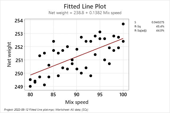
Figure 2 is a Fitted Line Plot that shows the relationship between mixing speed and net weight.

The Fitted Line Plot indicates a fairly weak positive correlation between the process factor and the process response. But despite the weak correlation, new process knowledge like this can increase the probability of DOE success. For example, the Fitted Line Plot can justify including Mix Speed as a process factor.
The Fitted Line Plot also provides, upon request, diagnostics like the Normal Probability Plot of the Residuals and a Residuals Versus Fits graph. Both graphics can provide useful insight on process behavior. It’s cousin, the Scatter Plot, provides a graphical look at the data, but usually without the diagnostics.
Summary
This simple case study is an excellent example of the application of The Scientific Method. The DOE team started with observations, assisted by guidance from production operators. They applied reason, formed a hypothesis and collected data. The Fitted Line Plot visualized the data and is a form of simple experimentation itself, helping experimenters get the DOE design right the first time around. We can optimize processes incredibly well with a designed experiment, but if we don’t choose factors and factor ranges well, our models may not be very useful. The takeaway is to consider using The Scientific Method and data mining before you plan your next experiment.
To share a personal anecdote, a common question raised during DOE course is “how do we choose the factors and factor ranges”. These questions were very well considered. DOE courses provide nice case studies with factors and factor ranges chosen for us. Unfortunately, the real world doesn’t work that way and its up to the experiment team to figure it all out.
Meanwhile, we cannot be sure of the origin of The Scientific Method, but it appears the first record of its use was by Ibn Al Haytham during the Golden Age of Islamic Science. We are grateful to him and perhaps his predecessors for his sage guidance.
To learn more about DOE check out our Error-proofed Design of Experiments course.
Next time, we’ll look at the use of Scatterplot Matrices for DOE prep.

Leave a Reply